Accessibility in React.js
Web apps must be accessible with React.js to accommodate everyone, including those with disabilities. This requires following WCAG and WAI-ARIA standards. ARIA attributes (such as role and aria-label), often named using camelCase in JSX (e.g., className instead of class, htmlFor instead of for); semantic HTML elements; associating labels with input elements; and programmatic keyboard focus management, including “skip links” are used to make React components accessible. Accessibility is also improved by responsive design with media queries. These techniques make React apps more inclusive and adaptive to varied user needs.

Key Principles for Accessibility in React Components
When making React components accessible, developers should follow these guidelines:
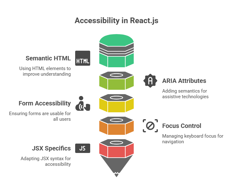
Semantic HTML: Semantic HTML components help assistive technology and browsers understand. Using tags like as <button>, <nav>, <main>, <article>, <aside>, <header>, <footer>, and <form> instead of div or span elements helps screen readers and assistive devices understand material Using an emoji in a <span> element with aria-label and role attribute set to img will be recognised as an image by accessibility software.
ARIA Attributes: Accessible ARIA properties Rich Internet Applications (ARIA) can give semantics and information to assistive technology when semantic HTML is insufficient. Screen reader users can benefit from features like aria-label, states like aria-checked, and roles like role=”button”.
Form Accessibility: Users must be able to engage with forms. Screen readers require form elements to be named using the <label> tag linked to the input’s id via the htmlFor attribute. Usability is further enhanced by offering unambiguous feedback for user input and validation, ideally in an approachable way.
Focus Control: For users who use assistive technology or a keyboard to navigate, controlling keyboard focus is essential. When needed, React enables programmatic focus management.It can be used to create “skip links” to the main content or trap emphasis in a modal dialogue. React’s event system includes onFocus and onBlur event handlers for just-in-time information and UI visibility.
JSX Specifics for Accessibility
Even though JSX and HTML are quite similar, React has a few syntactic distinctions that are crucial for accessibility and general functionality:
Attribute Naming: In React.js, JSX attribute naming follows JavaScript syntax instead than HTML. Camels are used to name React events and attributes. Since class is a restricted JavaScript keyword, React requires className instead of class. JSX treats the HTML for attribute, used for labels, as htmlFor. Instead of a string, you give a JavaScript code as the property value when attaching an event handler like onClick. This method also works for onChange, onFocus, onBlur, and onSubmit.
Event Handler Naming: React.js event handler name follows JavaScript syntax rather than HTML. React events are usually camelCase. Instead of HTML onclick, use JSX onClick. The for attribute for labels becomes htmlFor, and class becomes className in JSX because class is a reserved keyword in JavaScript.
Code Example:
Think of an input box where you wish to give instant feedback regarding the characters that are permitted. Semantic HTML and ARIA features can be used to make this feedback accessible.
import React, { useState } from 'react';

function FileNamer() {
  const [name, setName] = useState('');
  const [showAlert, setAlert] = useState(false);

  const handleSubmit = e => {
    e.preventDefault();
    console.log(`Saving file with name: ${name}.js`);
    alert(`File name saved: ${name}.js`);
  };

  return (
    <div className="flex items-center justify-center min-h-screen bg-gray-100 p-4">
      <div className="w-full max-w-sm p-8 bg-white rounded-2xl shadow-xl">
        <h2 className="text-2xl font-bold text-gray-800 mb-4">
          Preview: <span className="text-blue-600">{name || 'fileName'}</span>.js
        </h2>
        <form onSubmit={handleSubmit}>
          <label htmlFor="fileNameInput" className="block text-gray-700 font-semibold mb-2">
            File Name:
            <input
              autoComplete="off"
              id="fileNameInput"
              value={name}
              onChange={e => setName(e.target.value)}
              onFocus={() => setAlert(true)}
              onBlur={() => setAlert(false)}
              className="w-full mt-1 p-3 border border-gray-300 rounded-lg focus:outline-none focus:ring-2 focus:ring-blue-500"
            />
          </label>
          {showAlert && (
            <div className="mt-4 p-4 bg-yellow-100 border border-yellow-200 rounded-lg text-yellow-800 text-sm">
              <p className="flex items-center gap-2 mb-1">✅ Allowed: Alphanumeric characters</p>
              <p className="flex items-center gap-2">⛔ Not Allowed: Special characters like *</p>
            </div>
          )}
          <button
            type="submit"
            className="w-full mt-6 px-4 py-3 bg-blue-600 text-white font-bold rounded-lg shadow-md hover:bg-blue-700 focus:outline-none focus:ring-2 focus:ring-blue-500"
          >
            Save
          </button>
        </form>
      </div>
    </div>
  );
}

export default FileNamer;
Output:
Preview: fileName.js

File Name:    Save
This example shows how htmlFor and id bind the label element to the input, an essential accessibility practice. When input is focused, the role=”alert” and aria-live=”polite” div displays the feedback message.
role=”alert”: This alerts screen readers that this div contains urgent, critical, and time-sensitive information that must be shared immediately.
aria-live=”polite”: Assistive technologies wait until the user finishes their present task before reporting content changes. Our feedback emoticons (✅ and ⛔) are given role=”img” and aria-label attributes to help screen reader users understand the visual clues. The state of the input and the visibility of the accessibility feedback are dynamically managed by the event handlers onChange, onFocus, and onBlur.
Conclusion
To sum up, creating accessible React.js apps requires utilising best practices for JSX syntax, semantic HTML elements, and ARIA features to guarantee that all users, including those with disabilities, can use your program efficiently. Developers can design interfaces that easily integrate with assistive technologies by utilising htmlFor and id to label form inputs, role=”alert” and aria-live to provide real-time feedback, and programmatically managing focus. In addition to making apps more user-friendly and inclusive, these accessibility guidelines help enhance the general quality, maintainability, and flexibility of the code to accommodate a range of user requirements.
