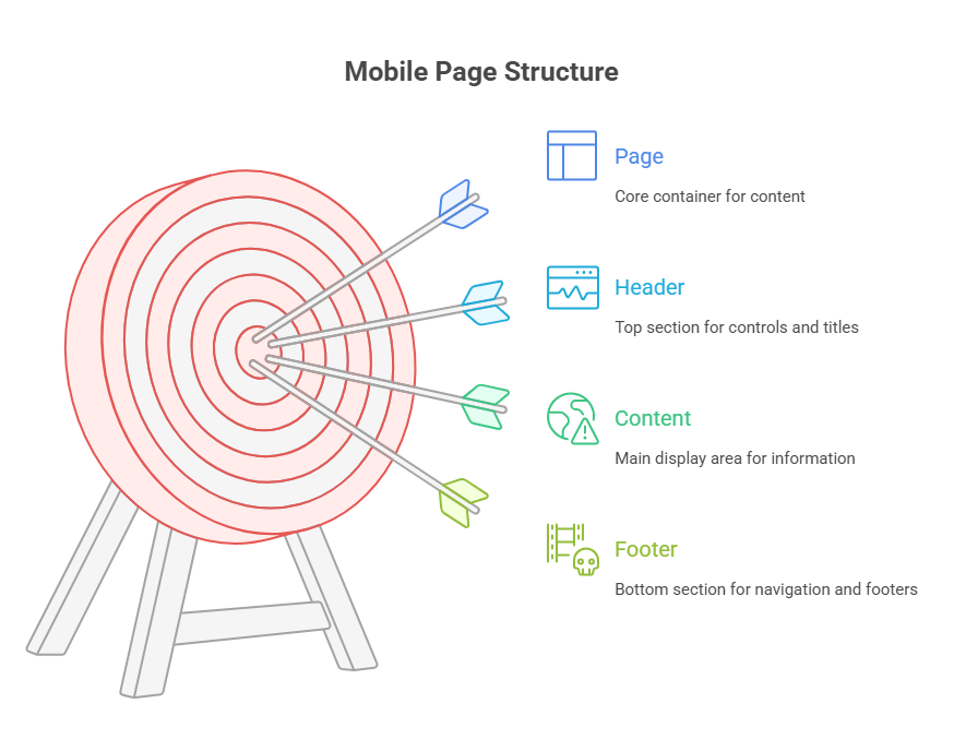
Mobile Page Structure

By utilising unique HTML5 data-attributes to specify a particular page structure, jQuery Mobile offers a powerful framework for developing mobile web applications. A uniform appearance and feel, seamless transitions, and effective navigation across a range of mobile devices are made possible by this structure.
jQuery Mobile’s fundamental function is to use the data-role=”page” tag on a contained HTML element to identify discrete content segments as pages inside an application. Encapsulating discrete views or screens of your program, these pages are intended to be self-contained content portions.
The main goal of this method is to allow jQuery Mobile Page Structure to gradually improve your semantic HTML documents. These elements are chosen by jQuery Mobile at initialisation, which then automatically adds the required CSS classes, additional markup, and event handlers to convert basic HTML into intricate, touch-enhanced UI elements. jQuery Mobile may adjust to either design, for example, using HTML5 semantic tags like , , and or simple div tags.
JQuery Mobile Page Structure usually contain three sections:
Header: A data-role=”header” element at the top may contain page-specific controls, navigation buttons, or titles. Usually defined by giving an HTML element the data-role=”header” attribute, the header is a discrete piece of material inside a page. Titles, navigation buttons, and other page-specific controls are intended to be contained in this header, which typically appears at the top of the page.
Content: Main page content is data-role=”content”. As the major display section where the main information is displayed, the content area is an essential component of a page. Usually, to specify it, an HTML element is given the data-role=”content” property. For example, the content area can be an HTML5 element or a div tag.
Footer: Usually found at the bottom of the page, the footer designated by data-role=”footer” is where footers, navigation bars, and other persistent components are placed.
key advantages for mobile web applications
Page Transitions: jQuery Mobile can produce seamless animation transitions (such as fade, flip, pop, or slide) between various content regions by treating them as “pages” within a single document. This gives the user a “application-like” experience. Using data-transition on a link, you can define a transition.
Navigation Management: Back buttons and deep linking are automatically managed by jQuery Mobile, along with navigation and browser history. Because each data-role=”page” element has its own URL within the program, bookmarking is possible.
Efficiency: Because an HTML file can include numerous pages, the browser may not need to constantly access the network once the original file has loaded. This may boost mobile device performance and battery life.
Consistency: It offers standard layouts, UI widgets, and interactions to ensure your program works on all devices. The core design tenet of jQuery is consistency, which refers to offering a consistent and dependable experience across various browsers and development contexts. Eliminating cross-browser incompatibilities is one of jQuery’s main benefits. jQuery addresses these inconsistencies by providing a consistent interface that works consistently across all platforms, even though JavaScript engines can change between browsers and cause code to behave differently.
Pages in the document body must be top-level siblings and not nested.
External Pages:
External HTML pages can be linked with jQuery Mobile. jQuery Mobile uses AJAX to fetch a linked file and add its data-role=”page” element to the DOM. This simplifies page management, but avoid duplicate IDs when loading pages asynchronously.
JQuery Mobile fetches external.html, extracts the data-role=”page” section, and displays it inside the application to treat it as an internal page. On external pages without data-role=”page” elements, jQuery Mobile Page Structure will throw an error. By appending a target property like blank or rel=”external” to the link, you can disable AJAX loading.
Building responsive and engaging mobile web applications using jQuery Mobile Page Structure requires a thorough system of data-role attributes as well as automatic page element and transition handling.
Code Example:
<!DOCTYPE html>
<html>
<head>
  <meta charset="utf-8">
  <title>jQuery Mobile Page Structure</title>
  <meta name="viewport" content="width=device-width, initial-scale=1">

  <!-- jQuery Mobile CSS and JS -->
  <link rel="stylesheet" href="https://code.jquery.com/mobile/1.4.5/jquery.mobile-1.4.5.min.css">
  <script src="https://code.jquery.com/jquery-1.11.3.min.js"></script>
  <script src="https://code.jquery.com/mobile/1.4.5/jquery.mobile-1.4.5.min.js"></script>
</head>

<body>

  <!-- Page 1 -->
  <div data-role="page" id="home">
    <div data-role="header">
      <h1>Home Page</h1>
    </div>
    <div data-role="content">
      <p>Welcome to the home page!</p>
      <a href="#about" data-transition="slide">Go to About Page</a>
    </div>
    <div data-role="footer">
      <h4>Footer - Home</h4>
    </div>
  </div>

  <!-- Page 2 -->
  <div data-role="page" id="about">
    <div data-role="header">
      <h1>About Page</h1>
    </div>
    <div data-role="content">
      <p>This is the about page content.</p>
      <a href="#home" data-transition="slide" data-direction="reverse">Back to Home</a>
    </div>
    <div data-role="footer">
      <h4>Footer - About</h4>
    </div>
  </div>

</body>
</html>
Output:
Home Page

Welcome to the home page!

Go to About Page

Footer - Home
Explanation of the Code
This jQuery Mobile Page Structure example demonstrates how to use data-role attributes to create a basic mobile web application. Data-role=”page” defines the app’s two pages (home and about), which are organised into a header, content area, and footer. Links such as are used to navigate between pages, and jQuery Mobile Page Structure handles seamless transitions using data-transition=”slide.” In addition to managing navigation history and automatically applying mobile styling, it also improves HTML for touch-friendly interfaces. Without requiring page reloads, this configuration produces a responsive and consistent mobile experience.
Conclusion
By defining self-contained pages with headers, content, and footers using HTML5 data-role attributes, jQuery Mobile provides a robust and organised method for creating mobile web applications. Using a single HTML file or external pages loaded using AJAX, this method enables developers to manage navigation history, create seamless transitions, and maintain consistent layouts across devices. It is perfect for creating responsive, app-like experiences on a variety of mobile Page Structure devices since it automatically transforms normal HTML elements into touch-friendly UI components.
