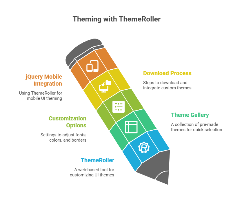
Theming with ThemeRoller

jQuery UI provides an advanced theming with themeroller system that lets you utilise a web-based dynamic theme engine called ThemeRoller to alter the look of user interface (UI) widgets. With this framework, web developers and designers may make aesthetically pleasing and standardised user interfaces for their web apps.
What is jQuery UI and Theming?
Based on the jQuery JavaScript library, jQuery UI is a complete collection of related plugins. Some of the many features it offers are:
- Users can choose, resize, sort, drag, and drop things with interaction components.
- widgets that function as tabs, buttons, accordions, datepickers, sliders, and dialogues.
- Core jQuery animations can be enhanced with further effects, including as colour animations, class animations, and sophisticated easing.
- ThemeRoller is part of a theme framework that makes sure all of the widgets on your website look the same.
If you want to provide your web application a unified and polished appearance, theme is essential. By separating colour and texture concepts from conventional layout, it provides a significant deal of visual design flexibility. In jQuery Mobile, which also makes use of theming with ThemeRoller, a “theme” is a cohesive visual style that unifies the UI and specifies everything from colours and drop shadows to typefaces.
ThemeRoller: The Interactive Theme Engine
ThemeRoller is a robust interactive theme engine for the web that is made available by jQuery UI. Creating highly customised, polished user interface elements is made quick and simple with its help. ThemeRoller is easily accessible from the jQuery UI user interface.
The standard procedure for utilising ThemeRoller entails:
Selecting a Theme from the Gallery: With thumbnails of several pre-made themes, Theming with ThemeRoller displays a Gallery tab. Frequently, these thumbnails illustrate the general aesthetic of the theme by showing how a calendar widget would seem. If you choose a theme (such as “UI darkness” or “Smoothness”), the example widgets on the right side of the page will instantly alter to reflect your choice. As a result, the influence of the theme may be briefly preview.
Customizing a Theme using “Roll Your Own”: After choosing a basic theme or the “Smoothness” theme, pick “Roll Your Own” to get further details. With the use of this tab’s accordion-style list of settings, you may adjust multiple theme elements, such as fonts, colours, and even the roundness of widget border corners. You can see instant visual feedback as you make changes since the sample widgets on the right refresh instantly.
Here’s a breakdown of the key customization sections:
Font Settings: The font face, weight, and size for widget titles and other text components are controlled by the font settings.
Corner Radius: Widget elements’ corners are rounded according to the Corner Radius. Corners are rounder when the value is higher, and square when the value is 0.
Header/Toolbar: Gives you the ability to change the background colour (or pattern), border, text colour, and icon colour. Adding patterns like diagonal stripes is made possible by theming with ThemeRoller, which also offers a colour wheel pop-up for simple colour choosing.
Content: Manages each widget’s displayed content’s colour, pattern, and font.
Clickable: Clickable elements of a widget, such as buttons or tabs, are defined by these parameters in three different states: normal (default), mouse-over (hover), and currently chosen (active).
Highlight: Allows you to change the font, colour, and pattern of highlighted areas in any widget, like the current date in a calendar.
Error: The colour, pattern, and font of error messages that widgets display are controlled by the error function.
Modal Screen for Overlays: Modifies the colour, pattern, and opacity of transparent displays over the main page during overlay or modal conversations.
Drop Shadows: Sets contour, colour, opacity, direction, and thickness of overlay and widget shadows.
Downloading a Theme: Your personalised theme is available for download from the “Build Your Download” page if you’re happy with it. By selecting the “Download link” for gallery themes or the “Download Theme button” for customised themes, you can access this page. Specific widgets, effects, and interactions that you wish to include in your download file can be chosen on the “Build Your Download” tab.
The settings for Widgets, Effects, Interactions, and UI Core are chosen by default. This lets you include only the features you require, making your library smaller. You are prompted to save a.zip file with your customised jQuery UI files when you click the “Download button.” Usually included in this archive are the css, development-bundle, and js directories.
Integrating the Downloaded Theme: Copy downloaded CSS and JS files to your web server’s folders. Apply the theme by linking the downloaded CSS file in the section of your HTML document. jQuery and jQuery UI JavaScript are required. Jquery-ui-1.7.2.custom.css contains all your styles to make jQuery UI widgets operate with your theme.
Adaptable jQuery Mobile uses theming with ThemeRoller for theming. The “swatches” (called “a,” “b,” “c,” “d,” and “e”) in jQuery Mobile themes have varied colours and visual accents. Data-theme lets you mix and match various swatches within a page to personalise the application’s design. By changing default styles in a separate stylesheet loaded after the main jQuery Mobile stylesheet, you can easily modify swatches, which are defined by CSS.
Code Example:
Continue to illustrate a jQuery UI Accordion widget with a ThemeRoller-downloaded custom theme.
<!DOCTYPE html>
<html lang="en">
<head>
  <meta charset="UTF-8">
  <title>jQuery UI Accordion with Custom Theme</title>

  <!-- Custom ThemeRoller CSS -->
  <link rel="stylesheet" href="https://code.jquery.com/ui/1.12.1/themes/smoothness/jquery-ui.css">

  <!-- jQuery and jQuery UI -->
  <script src="https://code.jquery.com/jquery-3.6.0.min.js"></script>
  <script src="https://code.jquery.com/ui/1.12.1/jquery-ui.min.js"></script>

  <!-- Initialize Accordion -->
  <script>
    $(function () {
      $("#accordion").accordion({
        header: "h3"
      });
    });
  </script>

  <style>
    body {
      font-family: Arial, sans-serif;
      width: 400px;
      margin: 50px auto;
    }
  </style>
</head>
<body>

  <h2>ThemeRoller Custom Theme</h2>

  <div id="accordion">
    <h3>Section 1</h3>
    <div>
      <p>This is the content of section 1.</p>
    </div>
    <h3>Section 2</h3>
    <div>
      <p>This is the content of section 2.</p>
    </div>
    <h3>Section 3</h3>
    <div>
      <p>This is the content of section 3.</p>
    </div>
  </div>

</body>
</html>
Output:
ThemeRoller Custom Theme

Section 1
This is the content of section 1.

Section 2
Section 3
Explanation of the Code
Linking CSS and JavaScript: Configure theming with ThemeRoller by linking jquery-ui-1.7.2.custom.css in the <head> section to integrate JavaScript and CSS. Enable accordion widget functionality by binding jquery.min.js to jquery-ui.min.js in the <script> tag. Before using jQuery UI, jQuery must load.
HTML Structure: The accordion is contained in the <div id=”accordion”> element in HTML. Section text can be collapsed by using <div> tags that come after <h3> elements with clickable heads.
jQuery Initialization: $(document).Ready() prevents JavaScript code from running until the DOM is loaded and parsed. Avoiding script manipulation of non-existent elements requires this step.
Applying the Widget: $(‘#accordion’) is printed.The widget’s application depends on accordion({ header: ‘h3’ });.
- A jQuery ID selector is used by $(‘#accordion’) to choose the particular div element based on its id attribute.
- An interactive accordion widget can be created from the selected HTML structure using the jQuery UI library’s.accordion() method.
- The option { header: ‘h3’ } is sent to the accordion function. It instructs the widget to use the <h3> elements inside the #accordion div as the clickable headers for every part that can be folded up.
When a browser opens this HTML file, jQuery UI will “progressively enhance” the semantic HTML structure. Headers, content panels, borders, fonts, colours, and other accordion elements will all automatically be given the distinctive appearance and feel you intended by the CSS rules from your theming with ThemeRoller-generated stylesheet. The accordion will be fully functional, with parts that are fashioned in accordance with your custom theme able to be expanded and collapsed by clicking on headings. This illustrates how ThemeRoller makes visual customisation easier and allows for the creation of sophisticated interfaces with little manual CSS coding.
